


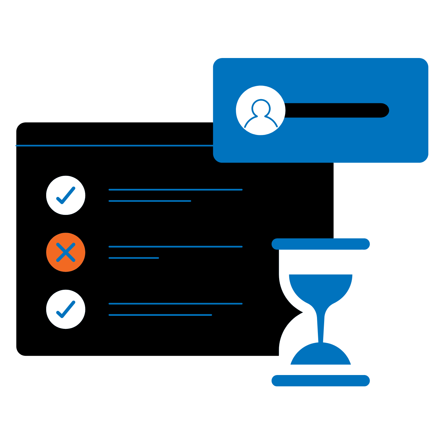
Law firms spend up to 6 hours a day per user on document creation.
Word LX saves an hour a day Per user
Mistakes can waste time, cost money and hurt the firms’ brand and reputation.
Imagine saving even an hour per day per user while reducing risk and improving brand reputation. Convert that saving into another billable hour, more revenue or improved client service.
Word LX is the ultimate legal document and template management system that includes powerful formatting tools. We give you the savings, you choose how to use it.
Build Better Legal Documents Faster. Boost Productivity and Quality.
Transform Microsoft® Word into the tool you always wanted.
Automate
Inefficient document processes and managing firm-approved content can lead to wasted time and reduced productivity.
Word LX™ ➡️ Efficiently develop and deploy customized templates to accelerate document creation and ensure consistency.
Standardize
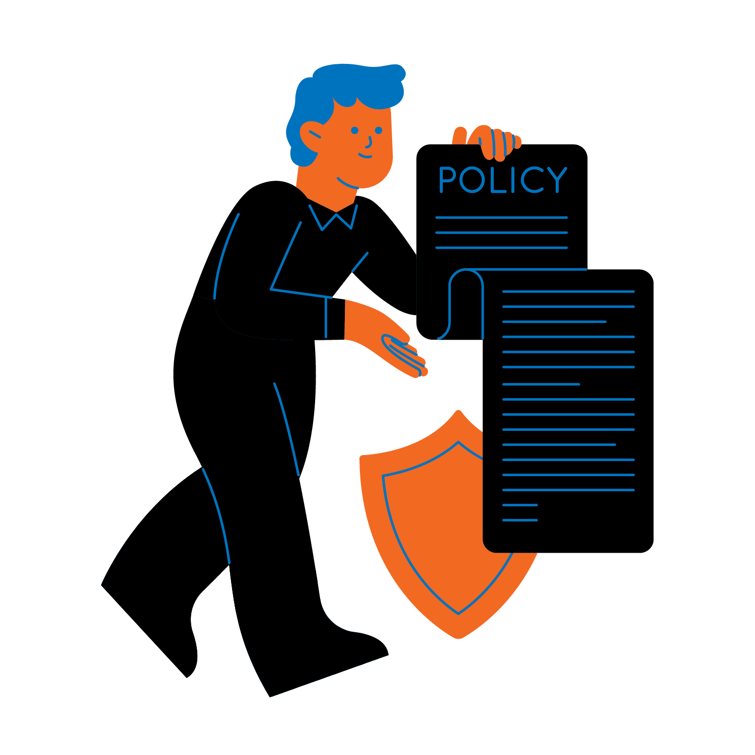
Standardizing legal document creation in Microsoft® Word can be difficult without the right tools.
Word LX™ ➡️ Protect your brand with consistent enforcement of firm standards.
Simplify
Firms face challenges with document creation which leads to quality, accuracy, and productivity issues.
Word LX™ ➡️ Simplify document creation with formatting and editing tools and quick access to firm approved templates.

Save time, generate revenue, knock stuff off your to-do list and protect your brand.
Improved Efficiency
Word LX saves you time. Period.
Many legal professionals use native Microsoft Word for up to 6 hours per day per person. That sucks.
Word LX makes quick work of common tasks so you can focus on clients and not formatting and editing.
- Template Automation: Manage and access templates and speed document creation with dynamic content and other tools.
- Advanced Formatting & Editing: Apply styles and numbering schemes. Insert letterhead, tables, signing lines, and watermarks. Add appendices, exhibit stamps, and schedules.
- Court Form Automation: Accelerate court form creation from start to finish.
- Firm-Wide collaboration: Enable any user to create documents for anyone in the firm, in any office, and in any language.
- Print Optimization: Optimize printing tasks for faster, more efficient output.
Minimize Risk
Word LX protects your reputation and minimizes risk.

Errors affect your reputation and can result in irreparable harm.
- Design Templates: Design, store and access customized agreements, forms, and contracts in a few clicks.
- Dynamic Data Integration: Seamlessly insert contact and client information through integrations – including Microsoft 365, NetDocuments, and iManage
- Smart Clause Libraries: Build and manage clauses and access content. Apply logic and intelligence – no programming required.
- Dynamic Content: Enable dynamic content and easily access clauses from one managed source.
- Assemble Documents: Quickly select and assign clauses to templates.
Consistent Branding
Word LX knows your brand matters.
Inconsistent branding undermines trust and dilutes your message, whereas brand consistency results in an avg. 23% revenue increase.
- Firm-Branded Automated Templates: Define and implement standards for consistent and perfectly styled documents – all done from the ribbon.
- Craft Custom Templates: Design, store, and access agreements with dynamic fields.
- Document Assembly: Simplify creation of standard clause documents, such as contracts, wills and agreements.
What Our Clients Say

“We recently implemented Word LX replacing our in-house template solution. The feedback from our users on Word LX has been extremely positive but what also really stood out was the thoughtful change management process that accompanied the rollout and the support from the Word LX implementation team.”
Erica Boica, Director of Business Technology
“Our firm is a long-standing Word LX client and migrated to the new version in 2023. It’s easy to train and get new users to adopt quickly and the web-based admin portal makes it simpler than ever to manage our templates, users and make other system changes. Word LX makes our firm more efficient and our staff and lawyers love it.”
Mike Allicock, Firm Financial Officer

“The Word LX team are legal document experts and they have a deep understanding of the document creation needs of law firms. If you want a cost-effective tools that will save your staff and lawyers time with documents, take a close look at Word LX.”
Jeanette Barba, Chief Administrative Officer

“Word LX standardized formatting and automation facilitates the quick production of documents leaving professionals free to focus on the content of their documents.”
Laurie Hause, McKenzie Lake

“Word LX saves us time, templates are easy to access, and most importantly, it’s easy for people to use it.”
Patricia Smith, Folgers Rubinoff

“Documents are created faster and more consistently. Formatting and editing tasks are far easier. This adds up to huge time savings for our firm.”
Tracey Fadlallah, Lenczer Slaght

“The biggest benefit of using Word LX is it allows us to create good looking, consistent documents and anyone can use it from anywhere. The Document Assembly tools allow us to create complex documents efficiently.”
Rachel Puma, Robins Appleby LLP.

“The customized templates have significantly improved our firm-branded correspondence and it gives us a powerful set of tools to save time and produce consistent documents. Any firm that wants to boost productivity and improve quality should give Word LX a very close look.”